Add TOPKHOJ as a Preferred Source on Google
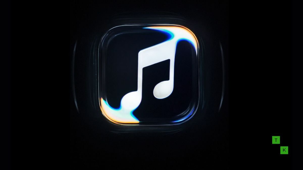
After more than a decade of anchoring its streaming identity behind a bright magenta-and-red double eighth note, the Apple Music new logo has officially made its public debut under a striking, analog-first creative campaign titled “Made by Sound.” Developed in close collaboration with Grammy-winning British electronic producer Fred again.. and acoustic engineering studio NEST Acoustics, the rebrand abandons traditional two-dimensional digital graphics in favor of a kinetic, liquid-glass black note literally sculpted by physical sound waves.
The visual revamp marks Apple Music’s most consequential aesthetic transition since the service launched in 2015.
Alongside the fluid emblem, the update introduces a bolder, all-lowercase “music” wordmark designed to complement Apple’s wider Liquid Glass interface aesthetic across macOS and iOS. However, as with any major corporate identity refresh, the transition from an iconic colorful icon to a monochromatic analog sculpture has sparked an immediate divide among listeners.
The ‘Made by Sound’ Process: Real Fluid Physics Over CGI
In an era where tech giants routinely generate visual assets through 3D rendering software and generative algorithms, the standout achievement of the new emblem is its reliance on practical, real-time filmmaking:
- Acoustic Transducer Sculpting: Rather than simulating fluid dynamics inside software like Houdini or Blender, Apple and NEST Acoustics engineered a physical acoustic rig. A high-precision tactile transducer was mounted beneath a shallow reservoir of specialized viscous black liquid.
- The Fred again.. Stems: Audio stems and low-end synth frequencies composed by Fred again.. were pumped directly through the fluid dish. As the bass frequencies vibrated the liquid, cymatic standing waves began to ripple across the surface.
- High-Speed Phantom Capture: Using specialized high-speed cinema cameras catching precise rim lighting, the production crew filmed the fluid surface in real time. At the exact resonance frequency where the ripples naturally cohered into the shape of a musical note, the frame was captured, giving the final logo organic surface tensions and refractive depths that digital rendering cannot replicate.
The Liquid Glass Era: Lowercase Type and Modern Restraint
Beyond the kinetic fluid note, the broader identity overhaul signals a shift toward editorial maturity:
- Tying Into ‘Liquid Glass’: The glossy, dimensional sheen of the new note directly mirrors Apple’s modern Liquid Glass user-interface design language, bringing refraction and tactile lighting into static app icons and promotional slates.
- The Bolder Lowercase Wordmark: The typography accompanying the logo has received its first structural tweak in years. The wordmark now sits in a heavier, punchier San Francisco font variant, styling the brand as “apple music” with a deliberate lowercase “m”. The flatter baseline balances the organic curves of the sound-shaped note.
- Monochrome Dominance: By default, the emblem adopts an inky, high-gloss black finish against clean off-white or dark slate backdrops, stepping away from the vibrant saturated gradients that characterized music streaming marketing during the late 2010s.
The Fan Divide: Creative Triumph vs. “Too Drab”
Predictably, the visual pivot has ignited intense debate across design forums and social media:
- Praise for Tactile Authenticity: Creative directors, typographers, and electronic music fans have widely applauded the collaboration. Celebrating the tangible craft of physical sound manipulation gives the service an artistic credibility that purely algorithmic platforms like Spotify struggle to match.
- Nostalgia for the Red Icon: On the other hand, mainstream subscribers have voiced frustration over the loss of the signature magenta-red app tile. Critics argue that a solid black musical note looks overly corporate, stark, or generic on a crowded phone home screen, lacking the warm, inviting energy of the classic icon.
Old vs. New: Apple Music Brand Evolution
| Identity Element | Classic Apple Music Branding (2015–2026) | New ‘Made by Sound’ Identity (2026) |
| Primary Color Palette | Vibrant Gradient (Pink, Magenta, Red) | Inky Monochromatic Black & Liquid Glass |
| Note Construction | Flat Vector 2D Graphic (Digital) | Acoustic Wave-Formed Fluid (Practical Analog Capture) |
| Collaborators | In-House Apple Design Team | Fred again.. + NEST Acoustics |
| Typography Style | Standard Title Case (“Apple Music”) | Bolder, Lowercase Modern Wordmark (“apple music”) |
| Visual Texture | Flat Clean Fill with Subtle Gradient | High-Gloss Liquid Refraction with Organic Surface Tension |
| Dynamic Assets | Simple Motion Graphic Zooms | Real Fluid Ripple Animations Driven by Audio Stems |
Rollout Strategy: London’s Apple Music Hall and Global Content
Rather than replacing every app icon overnight, Apple is staging a deliberate, media-first rollout:
- Broadcasts & Original Programming: The fluid logo will first appear as dynamic title sequences across Apple Music Live concert streams, artist interview series, curated radio broadcasts, and documentary features.
- Apple Music Hall Debut: The physical embodiment of the new branding will officially anchor the newly constructed Apple Music Hall in London, functioning as the visual centerpiece for exclusive live sessions and creator workshops.
- App Integration: A phased software update is expected to introduce optional app icon toggles within Apple Music settings, allowing subscribers to choose between the classic color palette and the new liquid-glass black emblem.
By grounding its corporate mark in real, analog audio physics, Apple is reminding listeners that behind its vast streaming algorithms, sound remains an inherently physical, human medium.
🚨 Stay Updated with TopKhoj! 🚨
Get the latest tech news, deals, and exclusive offers first!
📰 Visit News Section📲 Join our Telegram Channel for real-time updates and best deals!
🔗 Join Telegram Now💡 Stay informed and never miss a great deal with TopKhoj!
⚠️ Disclaimer: Any link provided in the article related to a product or service will redirect you to our affiliate partner(s)' website, which are affiliate links. This means that if you make a purchase through these links, we may earn a commission at no extra cost to you. This commission helps support our blog and our work.
🔔 All prices mentioned above are subject to change based on current offers and availability on e-commerce platforms. Please check the latest price and product details on the product page before making a purchase.