Add TOPKHOJ as a Preferred Source on Google
When a social media platform used by over two billion people tweaks its visual identity, even the subtle shifts in letterform curves spark instant internet debate. While app icons sit quietly on smartphone home screens becoming routine habits, the header text sitting at the top of a feed is something users look past millions of times every single day.
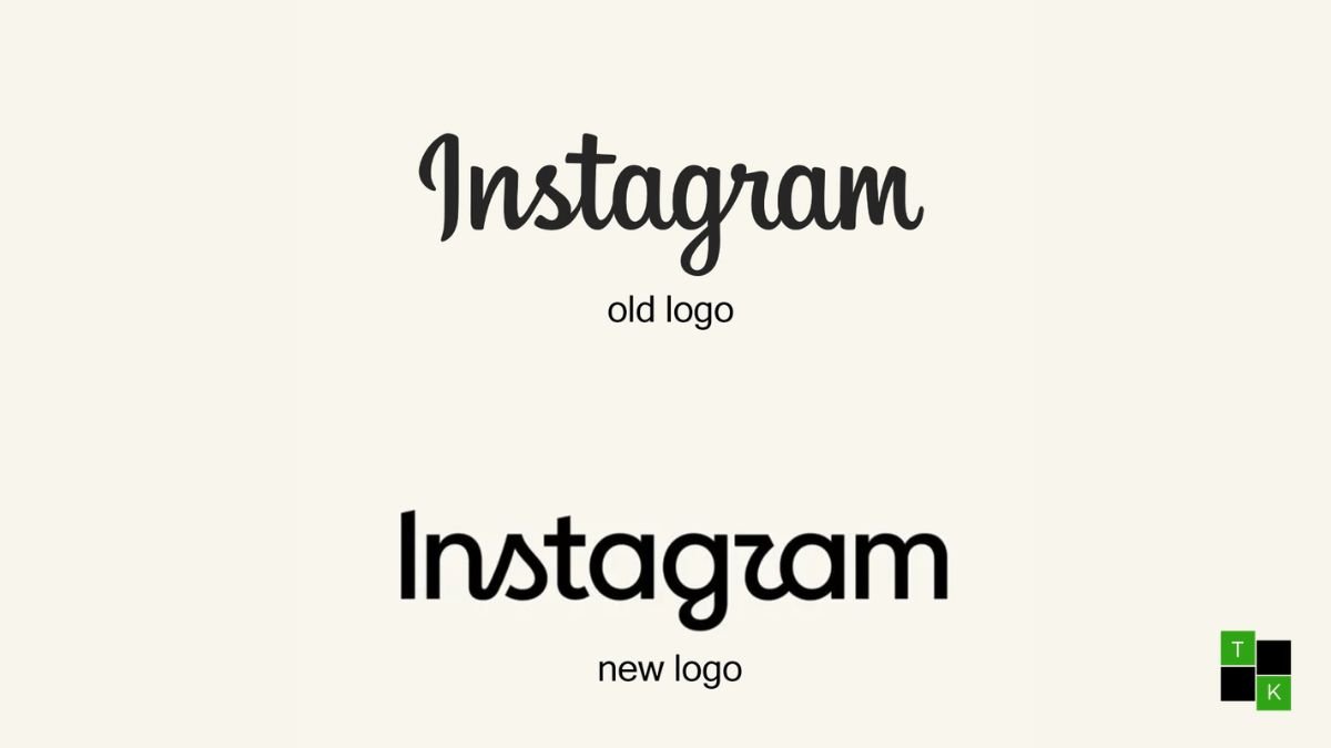
That subtle header just received its biggest update in ten years. Adam Mosseri, Head of Instagram, officially introduced the Instagram new wordmark logo across Threads and Instagram, sharing the platform’s first major typographic refresh since 2016.
Featuring tighter letter spacing, smoother curves, and a hybrid balance between cursive and print typography, the updated wordmark gives the header a modern polish. Meanwhile, Meta left the iconic pink and orange gradient app camera icon completely untouched, ensuring your muscle memory stays intact.
30-Second TL;DR
- First Overhaul in Ten Years: Instagram head Adam Mosseri officially revealed the Instagram new wordmark logo, marking the header’s first font update since 2016.
- Modern Hybrid Cursive: The redesigned header blends print and handwritten styles, featuring smoother curves on the ‘s’, ‘r’, and ‘g’ letters.
- App Icon Remains Untouched: The famous home screen icon—the pink, purple, and orange gradient camera square—stays completely unchanged.
Main News Details
The announcement came directly from Adam Mosseri, who posted a side-by-side comparison of the old and new wordmarks on Threads. Explaining the decision behind the refresh, Mosseri noted that the previous logo—originally introduced a decade ago—had started to feel dated on modern high-resolution smartphone screens.
Instagram Visual Asset Evolution
 ├── 2010 – 2016 ──> Skeuomorphic Brown Camera Icon + Billabong Cursive Font
 ├── 2016 – 2026 ──> Flat Pink & Orange Gradient Icon + Classic Cursive Header
 └── August 2026 ──> Same Gradient App Icon + Modernized Hybrid-Cursive Wordmark
The updated lettering introduces refined strokes across key characters. Specifically, the lowercase letters ‘s’, ‘r’, and ‘g’ feature distinctive, sail-like curves that recall classical penmanship while sharpening the overall line weight.
Naturally, the internet reacted immediately. While many designers praised the cleaner proportions, eagle-eyed users quickly pointed out that the newly shaped ‘r’ resembles a boat sail-leading a wave of viral memes claiming the header now reads as “Instagzam”.
“We updated the Instagram wordmark today, which is more than a decade old and felt dated. We feel the refresh is sharper and more modern, but references the original and has the simplicity and craft that’s always made it Instagram.” – Adam Mosseri, Head of Instagram
Key Highlights
| Branding Element | Previous Instagram Style (2016–2026) | New Instagram Wordmark (2026) |
| Primary Type Style | Classic Connected Script (Billabong-inspired) | Modernized Hybrid Script & Print |
| Lettering Curves | Rounded, relaxed cursive strokes | Sharper angles on ‘s’, ‘r’, and ‘g’ letters |
| Stroke Weight | Uniform traditional line thickness | Compact, high-contrast line proportions |
| Home Screen App Icon | Pink / Purple / Orange Gradient Camera Square | Completely Unchanged (No Changes) |
| In-App Placement | Top Navigation Header | Top Navigation Header |
| Announcement Channel | Official Press Release & Blog | Adam Mosseri via Threads & Instagram |
Detailed Explanation
Sharper Strokes and the “Instagzam” Debate
Typography updates on global platforms never go unnoticed. The redesigned wordmark keeps the general flow of Instagram’s signature handwritten look, but tightens the letterform geometry.
Wordmark Letterform Adjustments
 ├── Lowercase 's' ──> Sharpened top loop resembling a boat sail
 ├── Lowercase 'r' ──> Extended vertical stem with tighter curve
 ├── Lowercase 'g' ──> Refined bottom descender loop
 └── Overall Geometry ──> Compact kerning optimized for modern OLED screens
The Design Reality: The updated font bridge the gap between classic handwriting and modern digital screens. By sharpening the line contrast on the ‘s’ and ‘r’, the text stands out clearly against both dark mode and light mode backgrounds.
However, the distinct flourish on the letter ‘r’ sparked lighthearted banter across social media, with creators joking that the new shape resembles a ‘z’ or an italicized wedge.
Why the Home Screen App Icon Didn’t Move
Some users wondered why Meta didn’t launch a full brand overhaul by updating the app icon sitting on millions of home screens.
App Icon Asset Valuation
 ├── Instant Brand Recognition ──> Bright gradient recognized at microscopic icon sizes
 ├── User Habit Protection ──> Changing app icons disrupts muscle memory and app launches
 └── In-App Header Flexibility ──> Changing the wordmark updates marketing without breaking app habits
The Usability Perk: The pink, purple, and orange camera icon is one of the most recognizable visual assets in mobile software. Keeping the app icon identical means you won’t waste time searching your home screen for a rebranded button, even as the in-app header receives a sleek update.
Evolution vs. Corporate Sans-Serif Clichés
In recent years, many major tech brands have faced criticism for flattening their unique logos into bland, generic sans-serif fonts.
Tech Rebranding Approaches
 ├── Generic Corporate Trend ──> Stripping personality for plain geometric sans-serif fonts
 └── Instagram Refresh Strategy ──> Retaining cursive heritage while refining line weight
Preserving Heritage: Rather than replacing its handwritten script with a sterile corporate font, Instagram retained its human, expressive cursive roots. The update honors the original craft while making the lettering look crisp on high-density displays.
Timeline
        May 2016                       Early 2024                      August 13, 2026
────────────┬─────────────────────────────┬─────────────────────────────┬─────────────
            │                             │                             │
   Instagram Drops Brown Camera    Internal Design Team Begins    Adam Mosseri Unveils New
   For Gradient Icon & Cursive     Exploring Wordmark Typeface    Wordmark Logo on Threads
- May 2016: Instagram introduced its signature pink gradient app icon alongside its previous cursive wordmark.
- Early 2024: Meta’s internal brand design teams began exploring subtle typographic refinements to modernize text rendering across mobile apps.
- August 13, 2026: Adam Mosseri officially published the Instagram new wordmark logo on Threads and Instagram.
What is Confirmed
- Official Header Rollout: Confirmed live update to the wordmark header inside the latest app builds.
- App Icon Status: Verified that the home screen app icon remains 100% unchanged.
- Design Rationale: Confirmed statement from Adam Mosseri citing a modern, sharper refresh for a decade-old asset.
What is Not Confirmed
- Future App Icon Changes: Meta has declined to comment on whether a secondary app icon update will follow later in the year.
- Custom App Icon Options: Whether Instagram will re-introduce customizable retro app icons inside user settings remains unannounced.
Why This News Matters
The unveiling of the Instagram new wordmark logo highlights how modern consumer tech companies manage legacy branding. Instead of forcing a jarring rebrand that confuses users, Instagram chose an incremental evolution that sharpens its visual presentation on modern screens without disrupting daily app habits.
What Happens Next
The new wordmark is rolling out globally across iOS and Android updates starting today. Users will notice the refreshed header at the top of their main feed as their mobile apps update to the latest build version.
Conclusion
The launch of the new Instagram wordmark offers a clean, well-crafted update to a classic social media asset. By keeping the beloved gradient app icon untouched while giving the header lettering a sharper cursive polish, Instagram successfully balances nostalgic brand heritage with modern design.
🚨 Stay Updated with TopKhoj! 🚨
Get the latest tech news, deals, and exclusive offers first!
📰 Visit News Section📲 Join our Telegram Channel for real-time updates and best deals!
🔗 Join Telegram Now💡 Stay informed and never miss a great deal with TopKhoj!
⚠️ Disclaimer: Any link provided in the article related to a product or service will redirect you to our affiliate partner(s)' website, which are affiliate links. This means that if you make a purchase through these links, we may earn a commission at no extra cost to you. This commission helps support our blog and our work.
🔔 All prices mentioned above are subject to change based on current offers and availability on e-commerce platforms. Please check the latest price and product details on the product page before making a purchase.